Getting started with the Cost-Effectiveness Analysis
SpiceLogic Decision Tree Software lets you perform Cost-Effectiveness Analysis targeting healthcare disciplines. When you add a payoff from a decision tree node for the first time, you will be asked if you would like to perform a cost-effectiveness analysis as shown below.
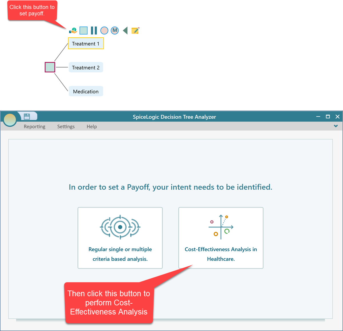
Then, you will get the Cost-Effectiveness Criteria editor window.
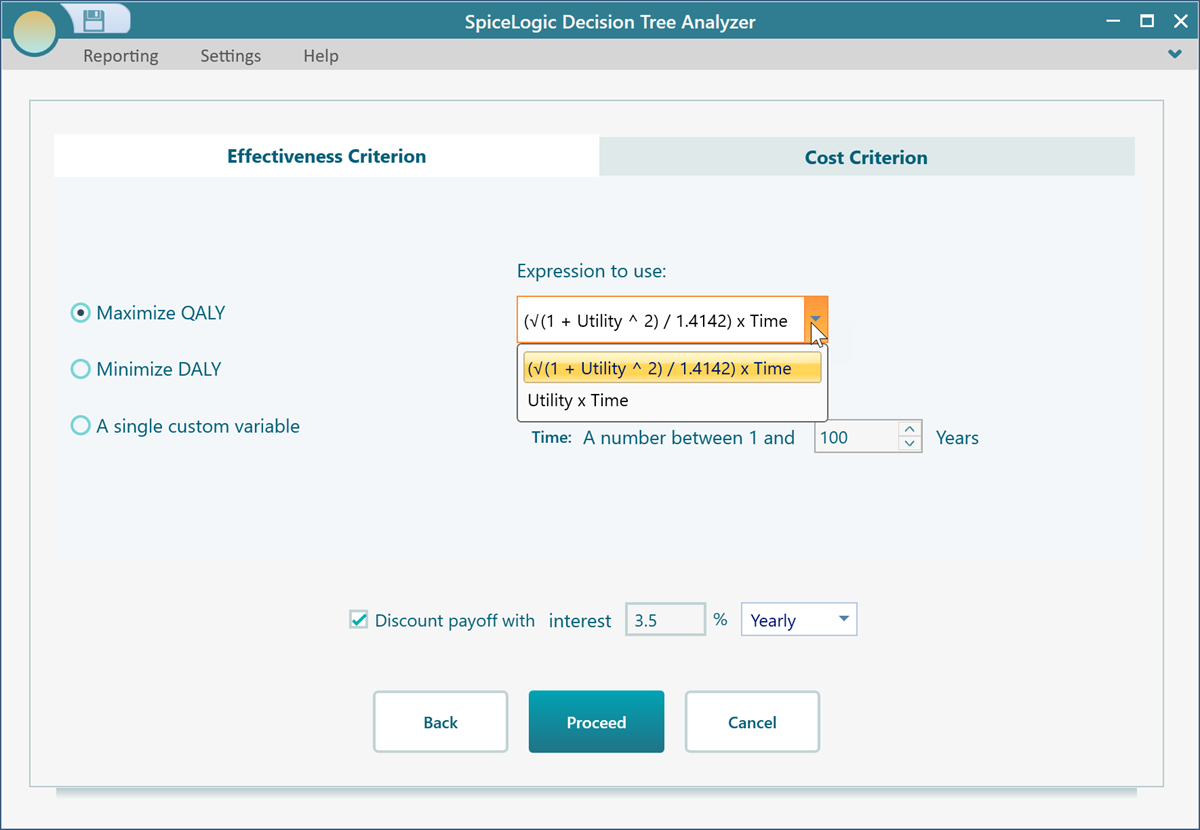
Modeling Effectiveness Criterion
The first option to model the effectiveness criterion is QALY or Quality-Adjusted Life year. notice that you have two common formulas to choose from, for QALY.
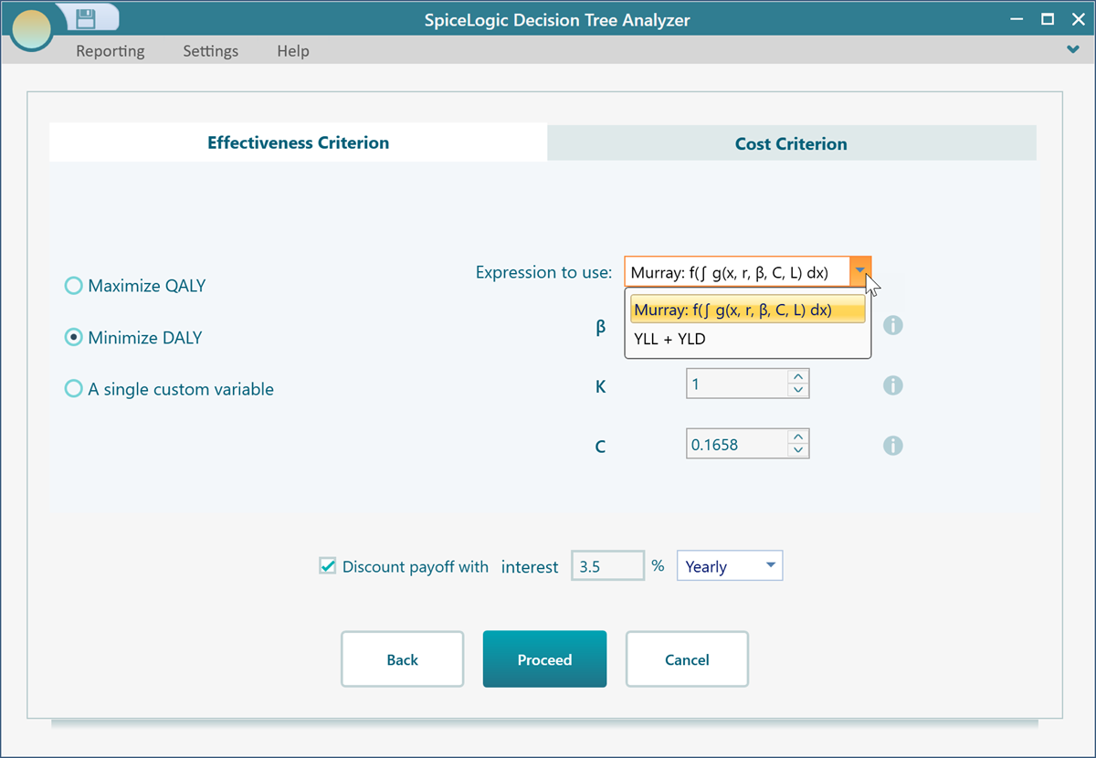
Then, check the circle box for DALY or Disability-adjusted life years. If you choose to use DALY in your Effectiveness criterion, then you can choose a formula for DALY as well.
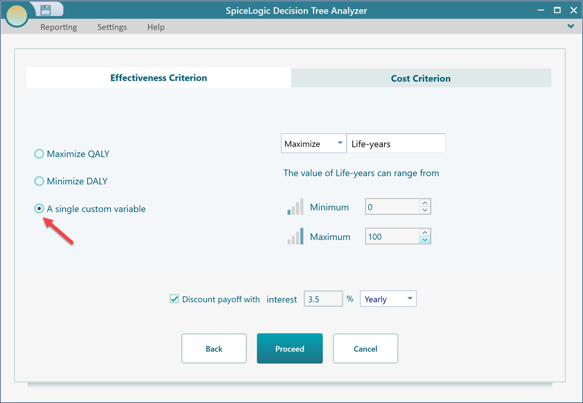
Finally, you can use a simple straightforward custom variable as your effectiveness. Just choose "A single custom variable" as shown below.
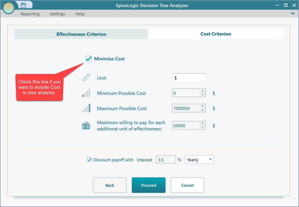
Modeling Cost Criterion
Then navigate to the Cost Criterion tab, you will find some options about Cost modeling.
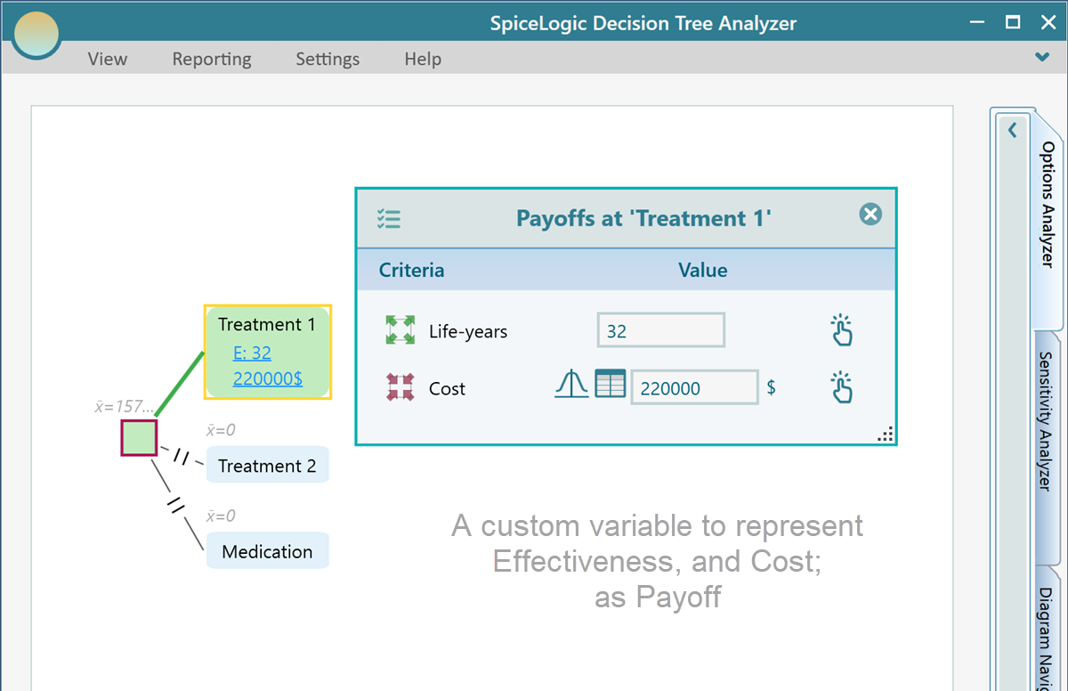
The user interface for Cost-Effectiveness in Payoff Editor
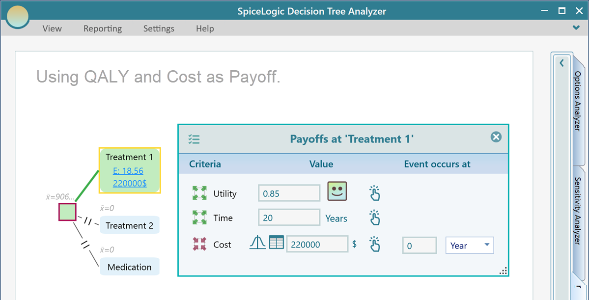
Once you set a criterion for your cost-effectiveness, in the Decision tree, you will find a payoff editor accordingly. Say, you chose to use QALY as your effectiveness criterion and also you included Cost in your analysis, then when you will open the Payoff editor in your decision tree, you will find the following user interface.
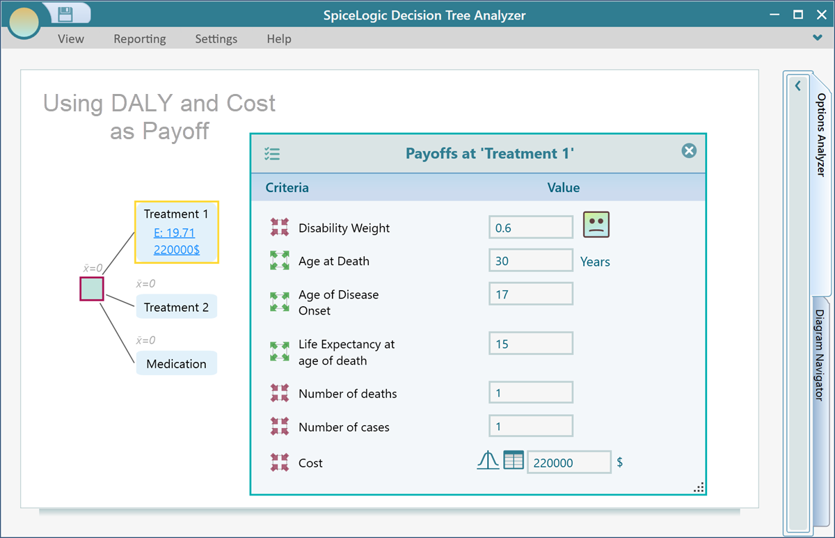
If you use DALY as a payoff, you may find the following user interface based on the fact that you chose the Murray formula.
And finally, if you chose to use a simple straight forward variable to represent your effectiveness, your payoff editor in the decision tree would look like
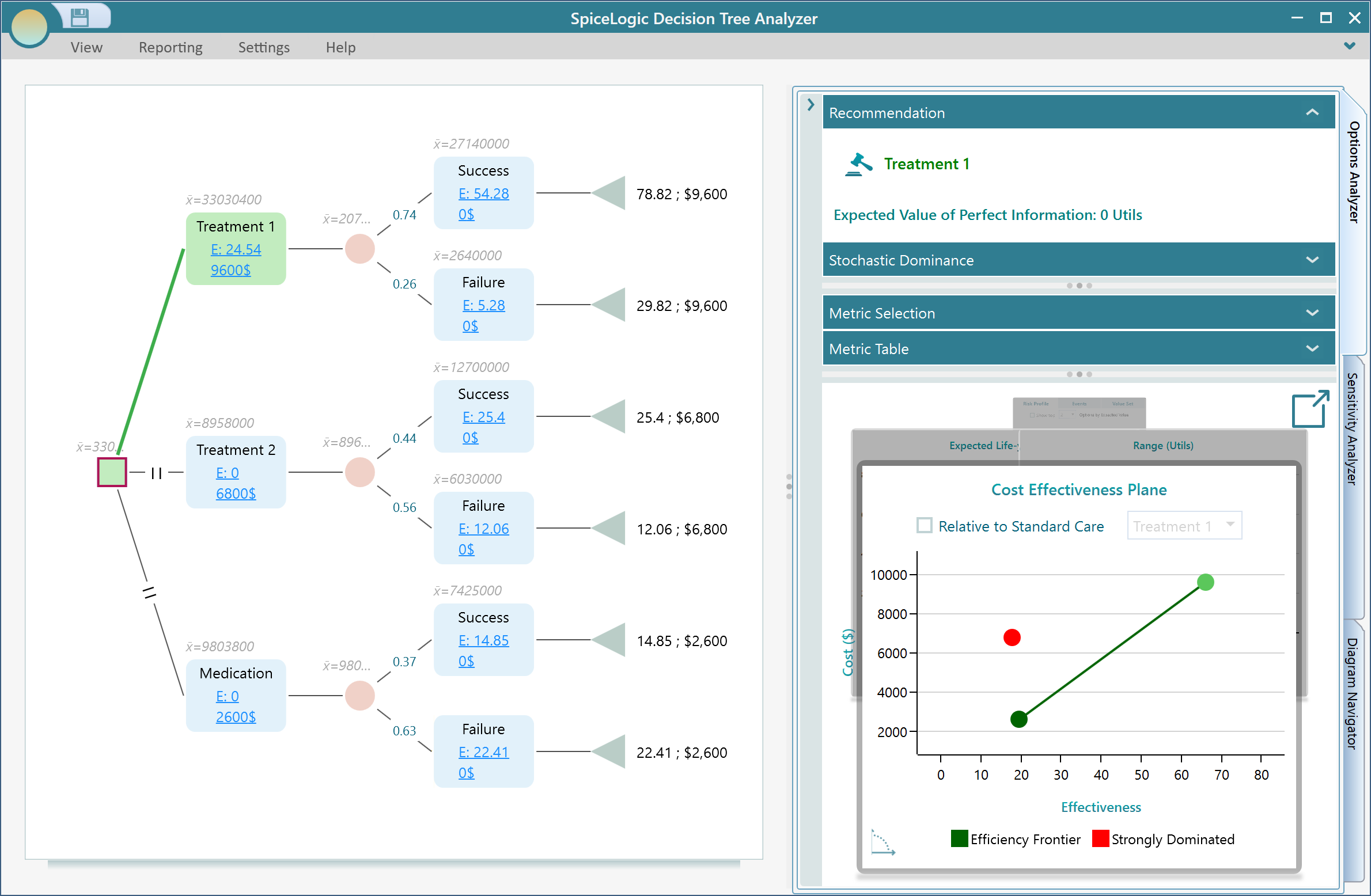
Analyzing the result
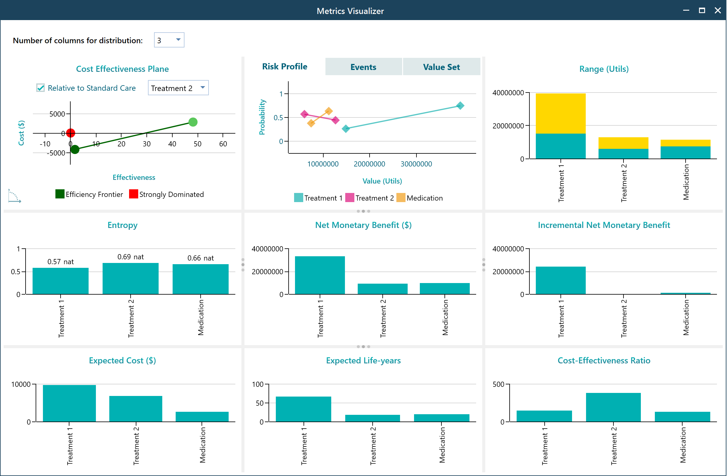
Say, you have set up your Cost-Effectiveness criterion and then set up your decision tree with Cost-effectiveness payoff as shown below. You will see a Cost-Effectiveness Plane shown in the chart carousel of the Options Analyzer tab,
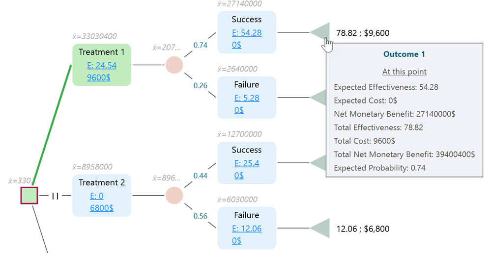
Hold your mouse over a node and see the tooltip reveals a lot of useful metrics.
Cost-Effectiveness Plane
On the cost-effectiveness plane, notice that every option is represented by a color-coded dot. The dots are shown in various colors that represent strongly dominated options, weakly dominated options, efficiency frontiers, etc. You can place your mouse over a dot and get the details about that option result, like Expected Effectiveness, Expected Cost, ICER (Incremental cost-effectiveness ratio), etc.
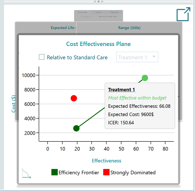
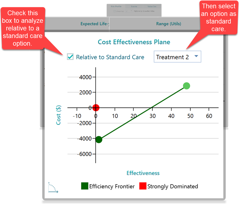
Relative to Standard Care
In healthcare, most of the time, it is required to compare the result related to a status quo or standard care. In the Cost-Effectiveness plane chart, you can choose an option to consider as the "Standard Care" option. Then the cost-effectiveness plane will be updated to show the relative metrics.
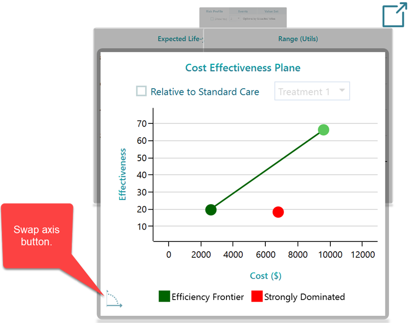
Swapping axis, cost / Effectiveness on X/Y axis or vice versa.
You can swap the axis so that the Cost will be shown on the X-axis and Effectiveness will be shown on the Y-axis. In that way, you can analyze, how effective an option is for an incremental cost. Click that swap button as shown below.
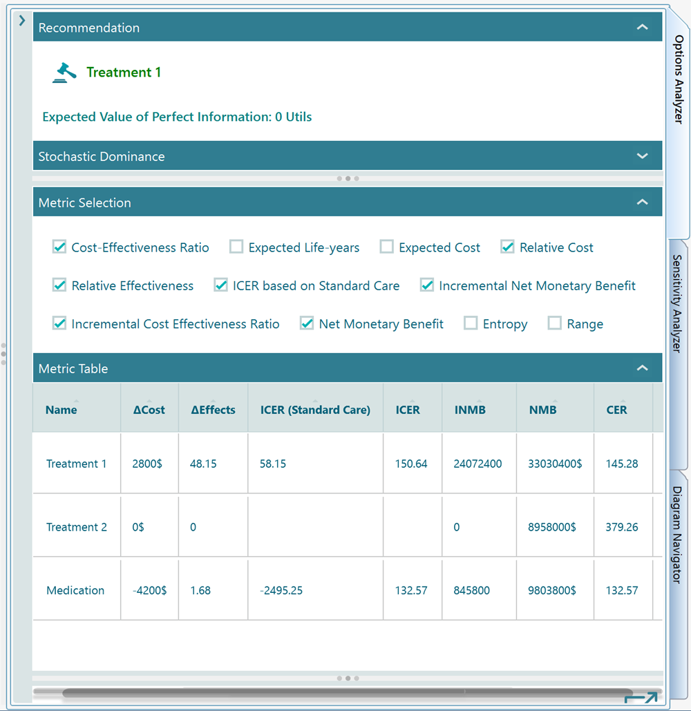
Metrics and Table
In the Options Analyzer panel, you will find a metric selector and table as shown below.
All charts
In the chart carousel, you may notice a pop-out button that lets you open all the charts based on selected metrics.