Getting started with the Cost-Effectiveness Analysis
The SpiceLogic Decision Tree software can do Cost-Effectiveness Analysis, the kind of analysis used most often in healthcare. The idea is simple. For each option you are weighing, you look at two things side by side: how much it costs, and how much good it does for the patient. A treatment that costs a little more but adds several healthy years may be worth it. A treatment that costs far more for almost no extra benefit usually is not. Cost-effectiveness analysis is how you tell those two apart with real numbers instead of a hunch.
Here is a quick example. Say drug A costs $5,000 and gives a patient three extra healthy years. Drug B costs $40,000 and gives three years and two months. Drug B looks better on paper, but you are paying a fortune for one extra month. This kind of analysis makes that trade-off plain so you can decide with your eyes open.
You do not have to turn anything on ahead of time. The first time you add a payoff to a node in your decision tree, the software asks whether you want to run a cost-effectiveness analysis, as shown below. Say yes, and the tree switches into cost-effectiveness mode for the rest of your model.
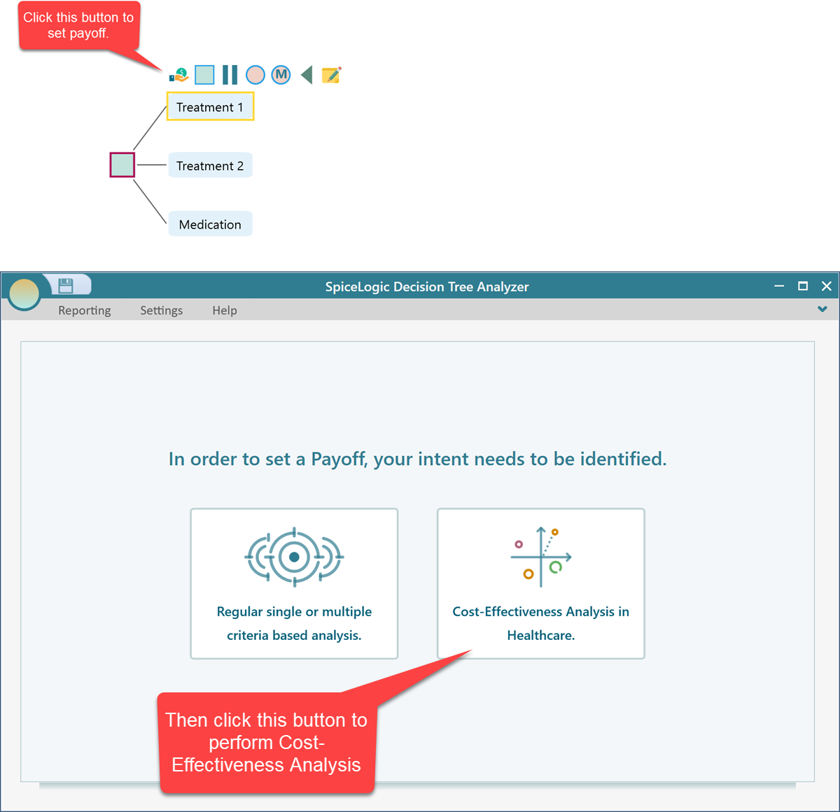
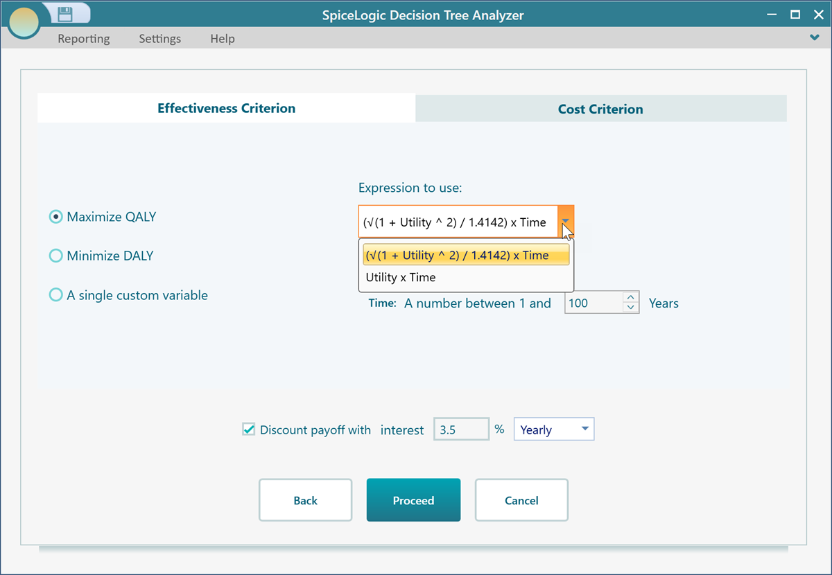
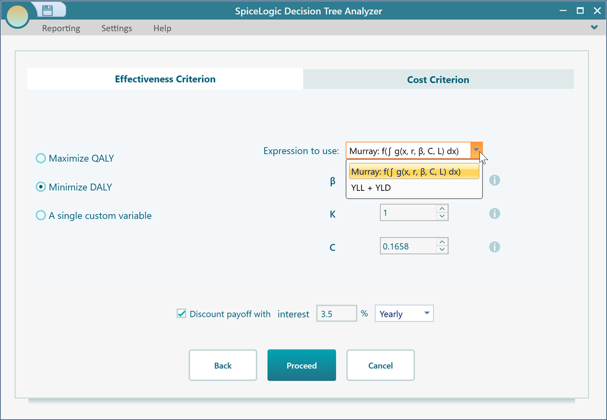
After you choose to run a cost-effectiveness analysis, the Cost-Effectiveness Criteria editor opens. This is where you tell the software two things: how you want to measure the benefit (the effectiveness), and how you want to measure the cost. Set these up once and every payoff in your tree will follow them.
Setting up the effectiveness measure
The first way to measure effectiveness is QALY, short for Quality-Adjusted Life Year. A QALY rolls two things into one number: how long a person lives and how good that time is. One year in perfect health counts as 1 QALY. A year lived in poor health, say at half your normal quality of life, counts as 0.5 QALY. So two extra years in great shape (2 QALY) score higher than two extra years bedridden (1 QALY). That way a treatment that keeps someone alive but very unwell does not look as good as one that gives them healthy, comfortable years. When you pick QALY, you get two common formulas to choose from, so you can match whichever one your study or your data follows.
The second way to measure effectiveness is DALY, short for Disability-Adjusted Life Year. A DALY is the flip side of a QALY. Instead of counting healthy years gained, it counts the healthy years lost to illness, disability, or early death. The lower the DALYs, the better the outcome, so a treatment that cuts DALYs is doing its job. Think of it as a count of bad years you are trying to shrink, where zero would be perfect. To use it, check the circle for DALY. Once DALY is selected, you can also pick which DALY formula you want to use, so the calculation lines up with the method your data was built on.
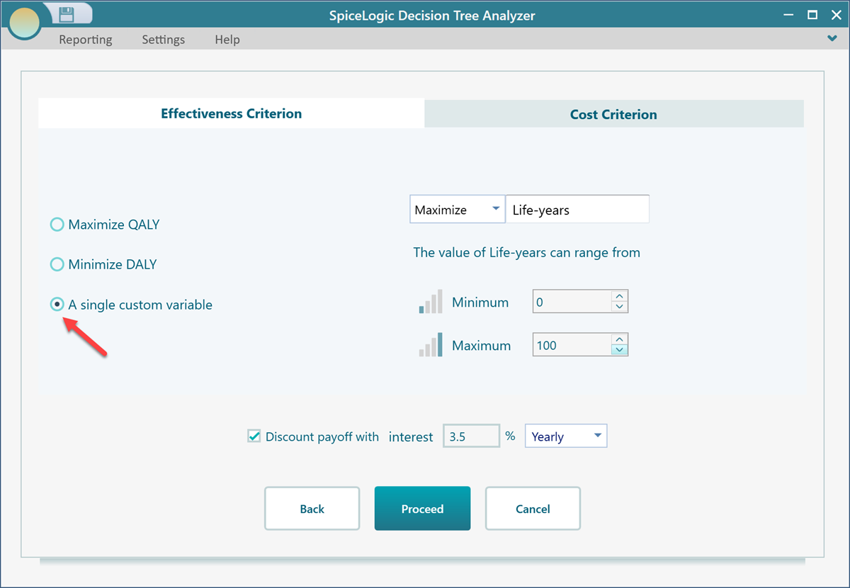
If you do not need QALY or DALY, there is a simpler choice. Pick "A single custom variable", shown below, and you can measure effectiveness any way you like. This is handy when your benefit is already a plain number, for example cases cured, infections prevented, or points gained on a health score. Say you run a vaccination program and the thing you track is infections prevented. You name the variable, type in that number, and the software treats it as your effectiveness. The rest of the analysis works exactly the same way.
Setting up the cost measure
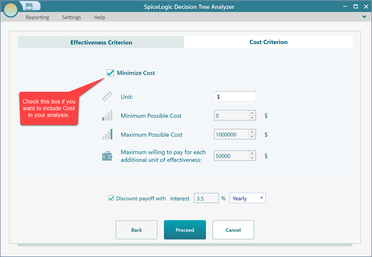
Now switch to the Cost Criterion tab. This is where you decide how cost is handled in the analysis. Cost is usually the money side of things, such as the price of a drug, a procedure, hospital days, or follow-up care, but you can use it for any resource you care about spending, for example nurse hours or hospital beds. Set it up here once and every payoff editor in your tree will ask you for cost in the same way.
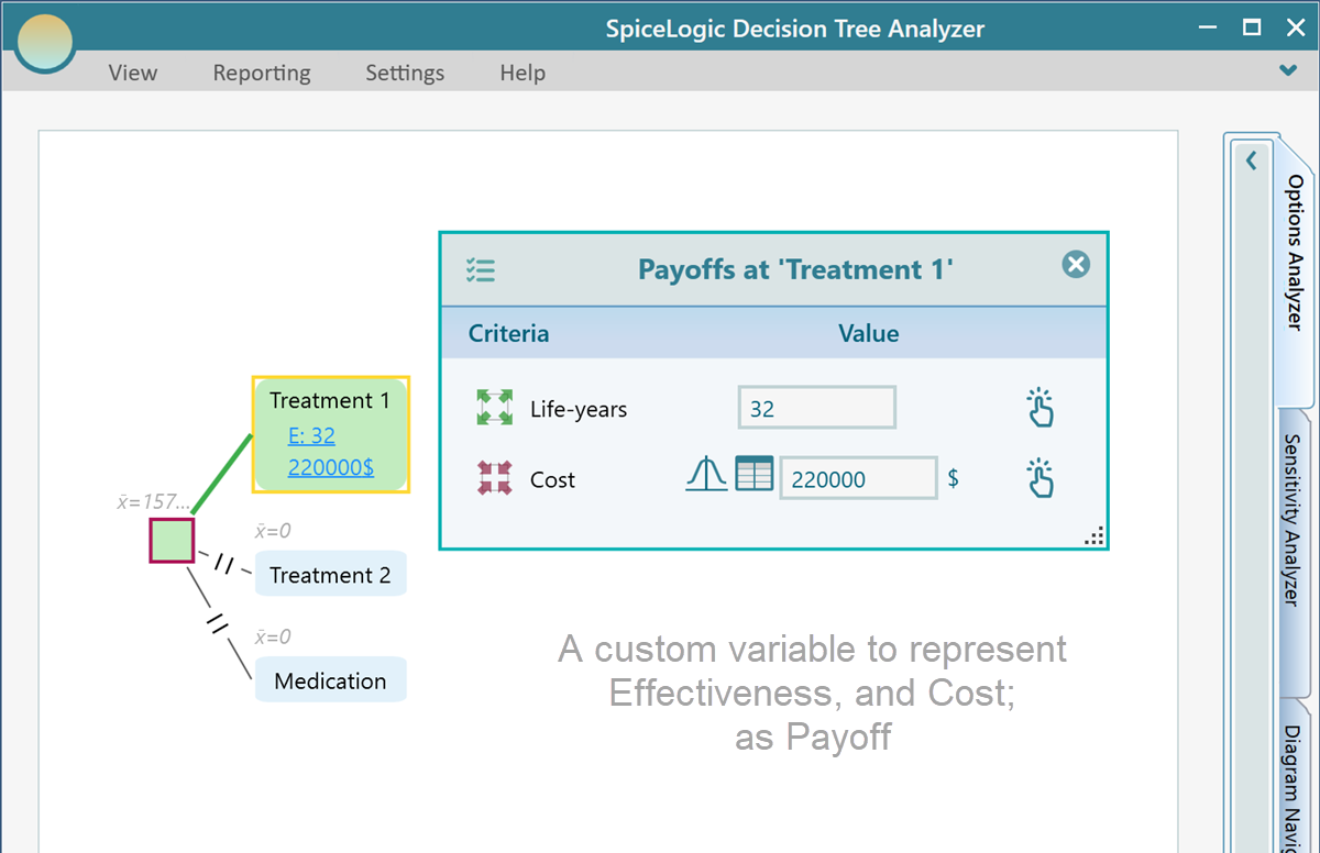
How the payoff editor looks in your tree
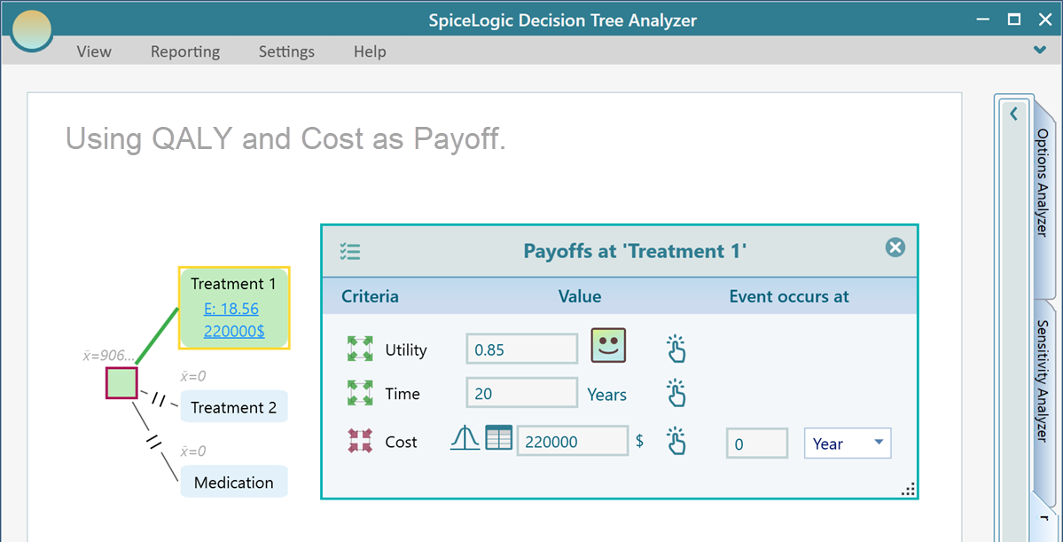
Once your effectiveness and cost are set, the payoff editor in the decision tree changes to match them. So you only ever fill in the numbers the analysis actually needs, with no spare boxes to confuse you. For example, if you chose QALY as your effectiveness measure and you also included cost, then opening the payoff editor on a tree node gives you the editor shown below, with a place for the QALY inputs and a place for the cost.
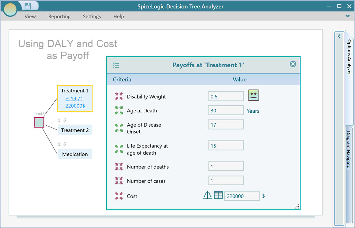
If you chose DALY instead, the payoff editor matches that choice. The example below shows how it looks when DALY is your effectiveness measure and you picked the Murray formula, so the fields you fill in line up with that formula.
And if you went with a single custom variable for effectiveness, the payoff editor stays the simplest of all. You just enter your one effectiveness value and the cost, as shown below.
Reading the results
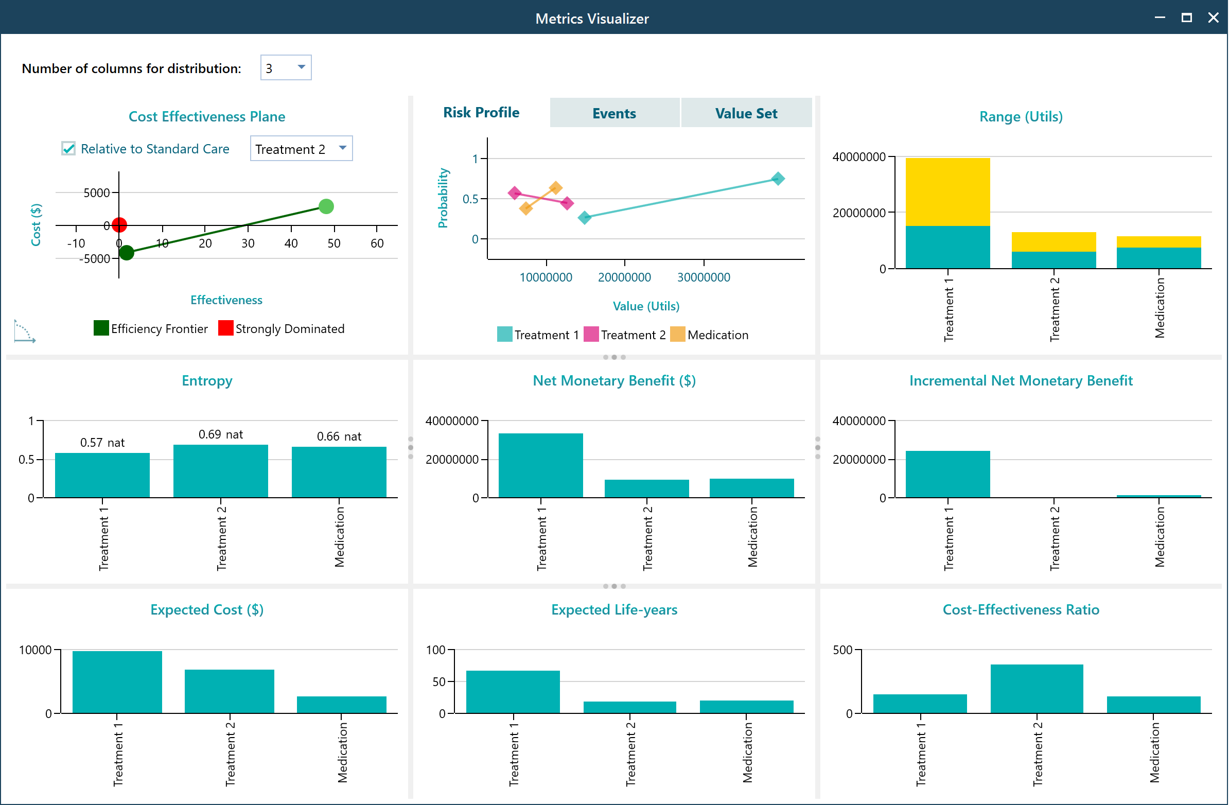
Suppose you have set up your cost-effectiveness criteria and built out your tree with cost-effectiveness payoffs, as shown below. Once that is done, the software draws a Cost-Effectiveness Plane for you. You will find it in the chart carousel on the Options Analyzer tab. This chart is where the whole analysis pays off. It plots every option by its cost and its effectiveness at the same time, so you can see at a glance which choices give you the most benefit for the money, and which ones cost a lot for little in return.
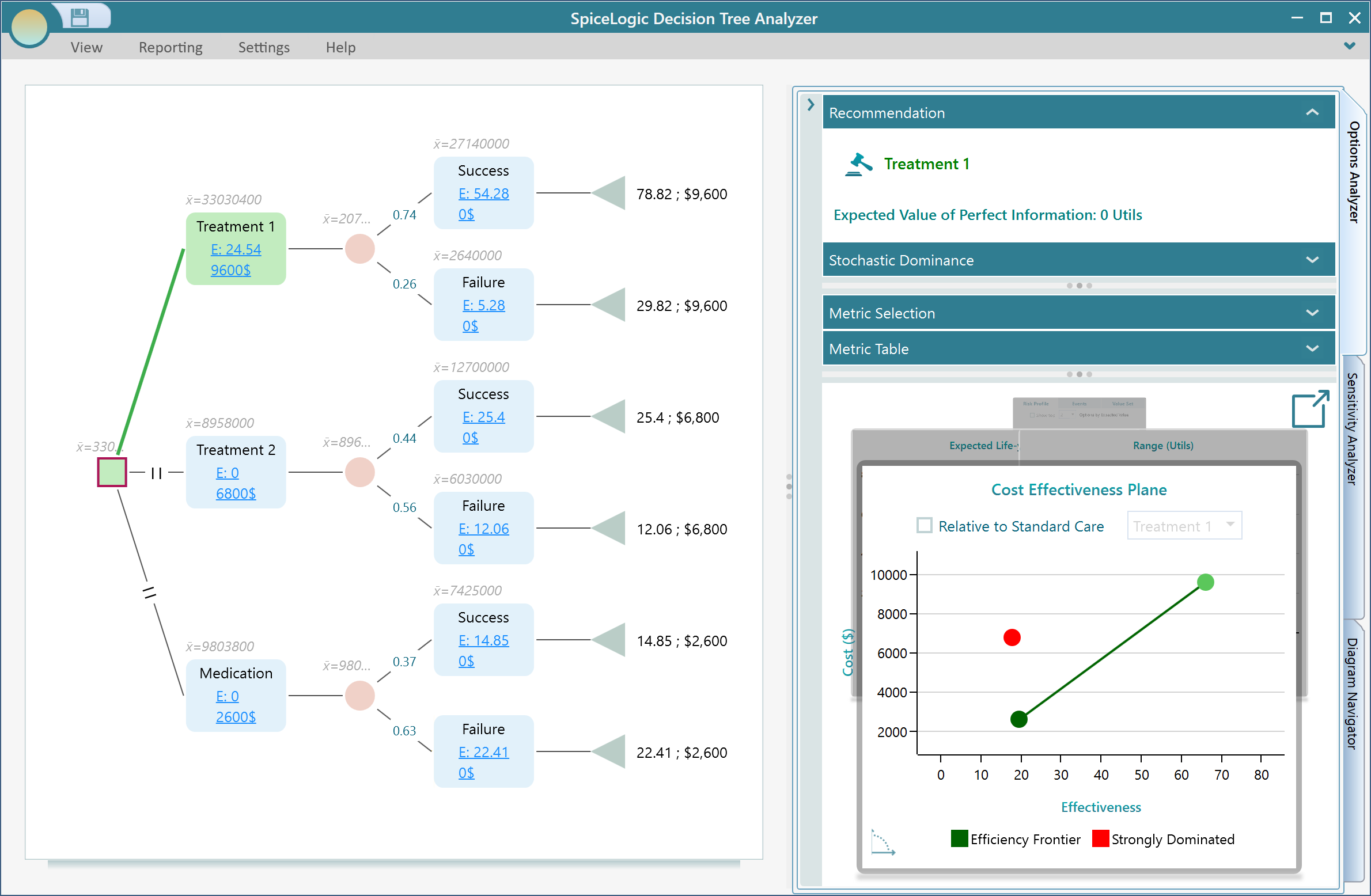
Hover your mouse over any node on the chart and a tooltip pops up with the key numbers for that option, so you can read the details without leaving the chart.
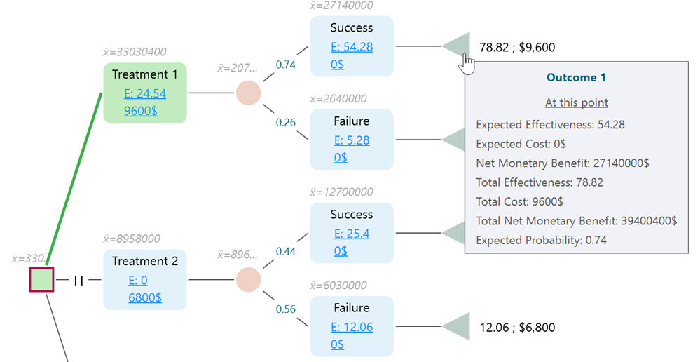
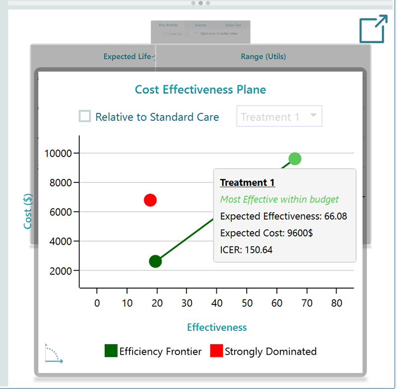
The Cost-Effectiveness Plane
On the cost-effectiveness plane, each option shows up as a single colored dot. The color tells you how that option stacks up against the others. Some colors mark options that are clearly worse than another choice (strongly dominated). Some mark options that are worse once you account for mixing strategies (weakly dominated). And some mark the options that sit on the efficiency frontier, the best you can do for the cost. The efficiency frontier is the line of "smart buys": for any point on it, there is no other option that gives you more effectiveness for the same or less cost.
Hover over a dot to see the full details for that option, including its Expected Effectiveness, its Expected Cost, and its ICER (Incremental Cost-Effectiveness Ratio). The ICER is the number decision-makers care about most. It tells you how much extra you pay for each extra unit of benefit when you step up from one option to the next, for example the extra cost per QALY gained. So if moving from one treatment to a better one costs $20,000 more and buys 2 more QALYs, the ICER is $10,000 per QALY.
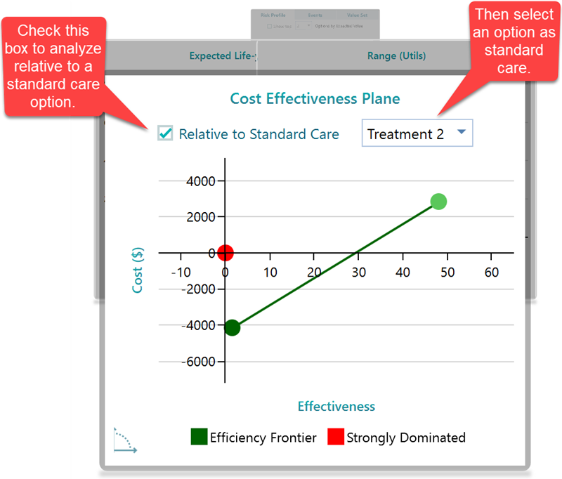
Comparing against standard care
In healthcare you usually do not judge an option on its own. You judge it against what you already do, the status quo or standard care. A new treatment is only worth talking about if it beats, or at least matches, the current one for the money. The cost-effectiveness plane lets you do exactly that. Pick one option to act as the "Standard Care" baseline, and the chart updates to show every other option relative to it. Now each dot tells you the extra cost and extra benefit it buys you compared to current practice, which is the comparison a hospital or insurer actually wants to see.
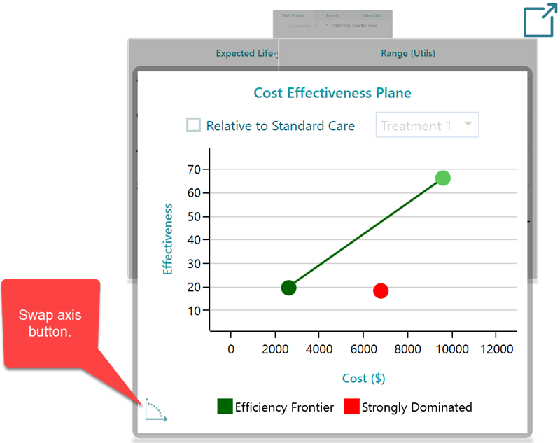
Swapping the axes
By default the chart puts effectiveness on one axis and cost on the other. You can flip them with the swap button, shown below, so cost moves to the X-axis and effectiveness moves to the Y-axis. The swap does not change your numbers, it just changes the view. Some people read the trade-off more easily one way than the other, so use whichever layout makes it clearer how much effectiveness you are getting for each extra dollar of cost.
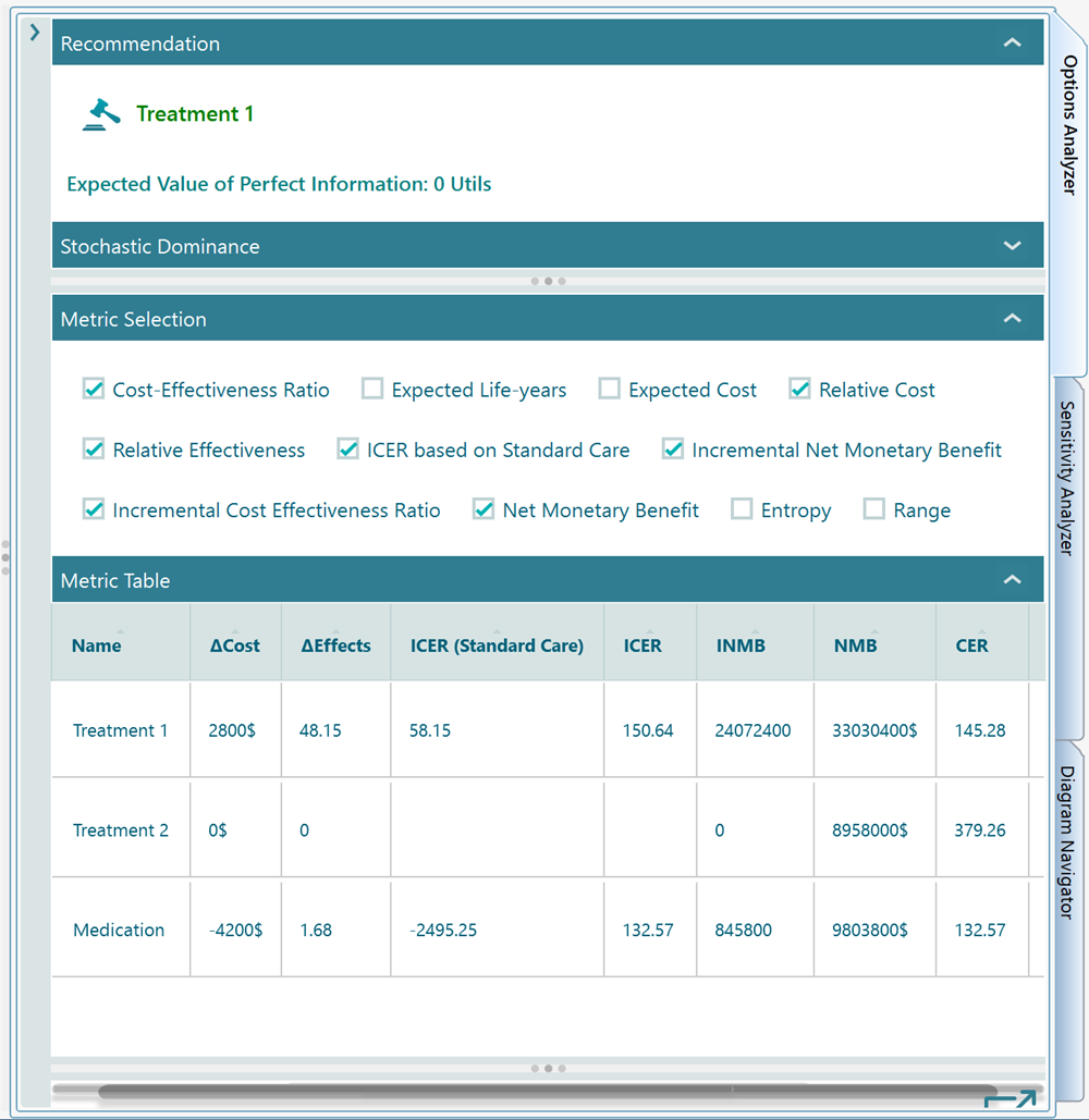
Metrics and the results table
The Options Analyzer panel also gives you a metric selector and a table, shown below. Pick the metric you want from the selector and the table lays out the numbers for every option in plain rows and columns. This is the view to use when you want to read or compare the exact figures, rather than eyeball them on the chart. For instance, you can line up the Expected Cost and ICER for each treatment side by side and copy those rows straight into a report.
Seeing all the charts at once
In the chart carousel there is a pop-out button. Click it and the software opens all the charts for the metrics you have selected, all together in one view instead of one at a time in the carousel. It is the quickest way to take in the whole picture, and it makes grabbing screenshots for a presentation or a paper much easier.