Sensitivity Analysis
Sensitivity analysis is a crucial part of any robust decision analysis. By sensitivity analysis, you can understand which variables are affecting your decision significantly and which variables are merely affecting the decision.
There are three ways you can check the sensitivity of a variable.
Observe the result based on the slider change
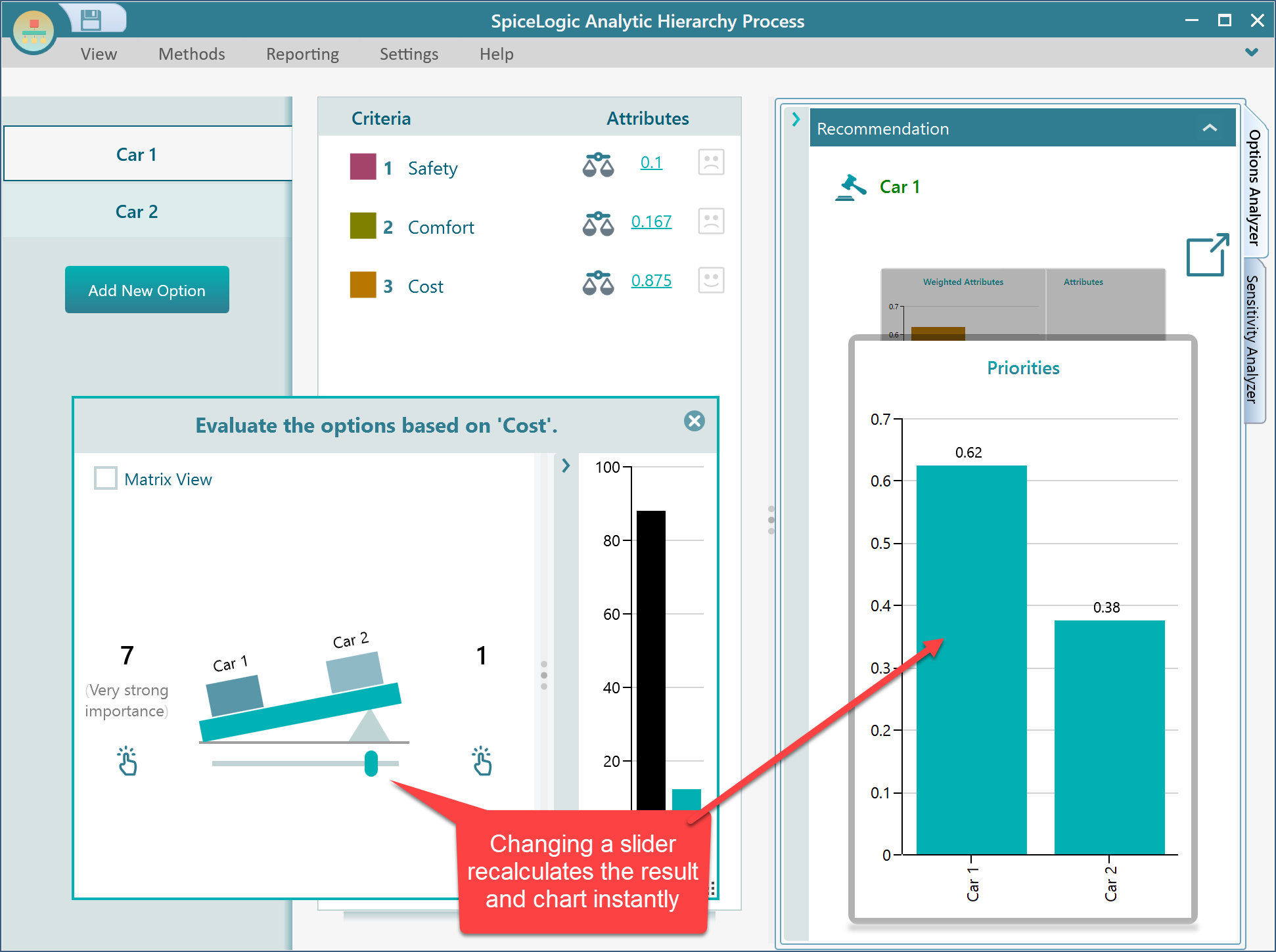
SpiceLogic AHP Software calculates the result instantly as you move a slider. So, when you change the pairwise comparison or any other slider value, notice how all the resulting charts change. In that way, you can get an idea about which variable is affecting a result in what way.
Criteria Sensitivity Analysis
In the Options Analyzer panel, there is a carousel of charts. Select the Weighted Attributes chart.
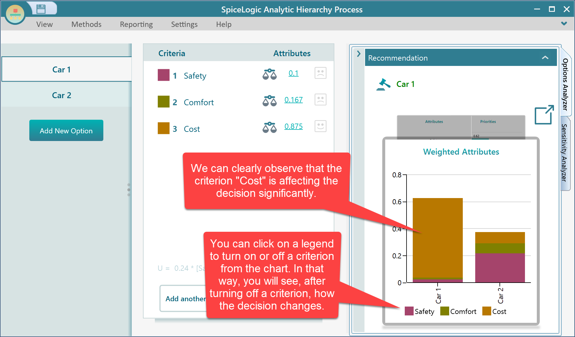
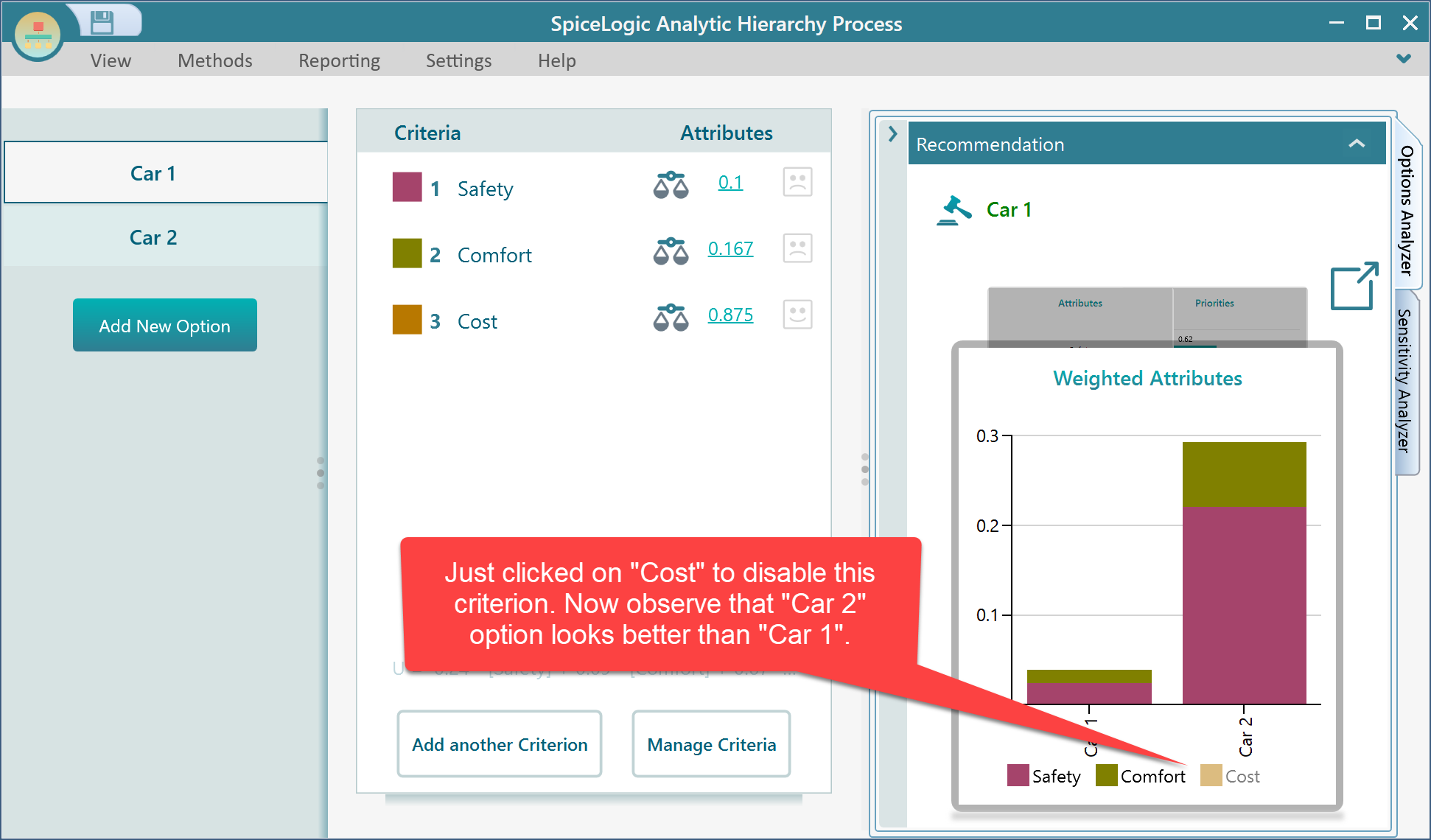
After clicking on the "Cost" legend from the above chart, the "cost" criterion is turned off. Now, notice the updated chart which implies that, if we do not consider cost, then instead of "Car 1", "Car 2" should be the better option.
One-way Sensitivity Analysis of a variable
The analytic Hierarchy Process software can perform a one-way sensitivity analysis and display a chart showing a variable's value change affects the Value of options. Expand the "Sensitivity Analyzer" tab to see the sensitive variables sorted by a rank of sensitivity. The rank we calculated is based on how many percentages of value change of the variable alters the final decision. In the following screenshot, the most sensitive variable's sensitivity is calculated as 74%. We use a formula as
Sensitivity Rank = 100 - Percentage of value change that alters the decision.
That means, that if the variable's value changes 100 - 74 = 26% within its range of possible values, then the selected decision will be changed.
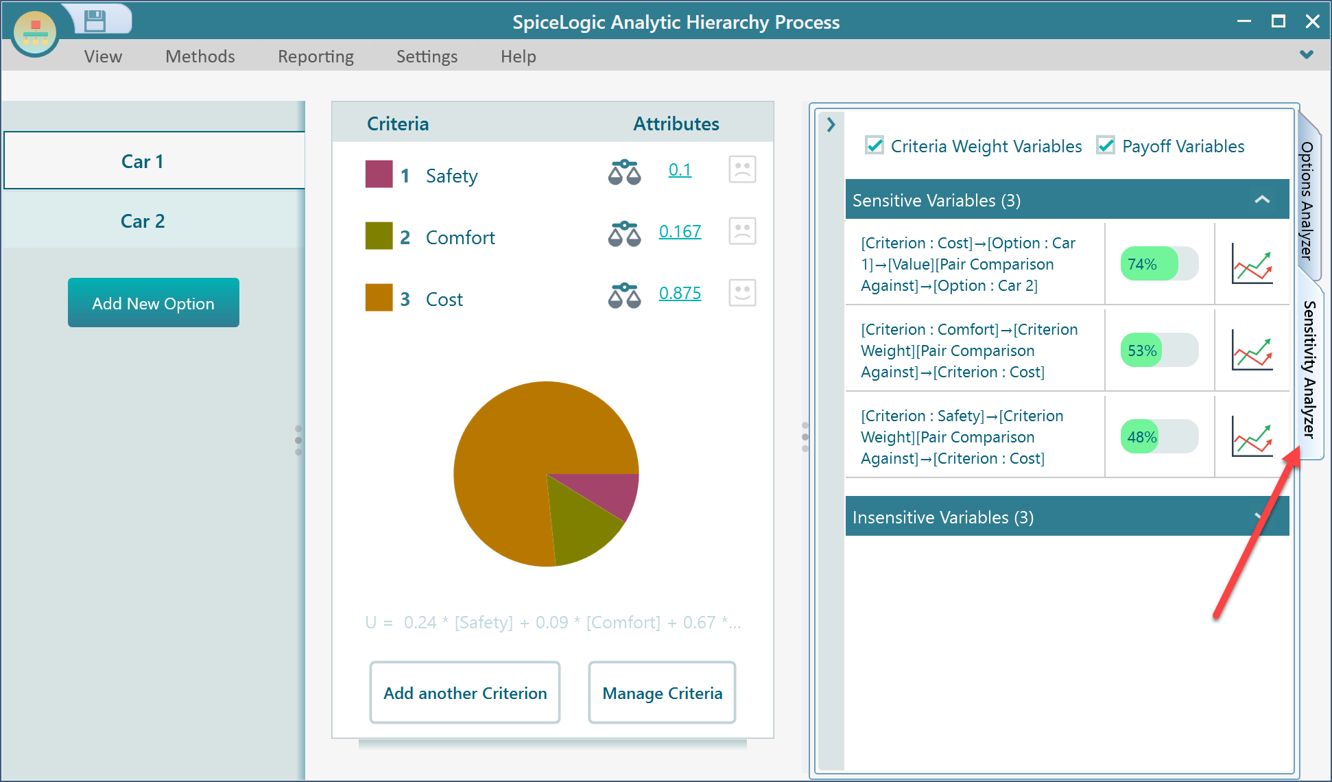
Click on a chart icon from the sensitivity analyzer to open that variable. For example, clicking on the top variable's chart button opens the following variable.
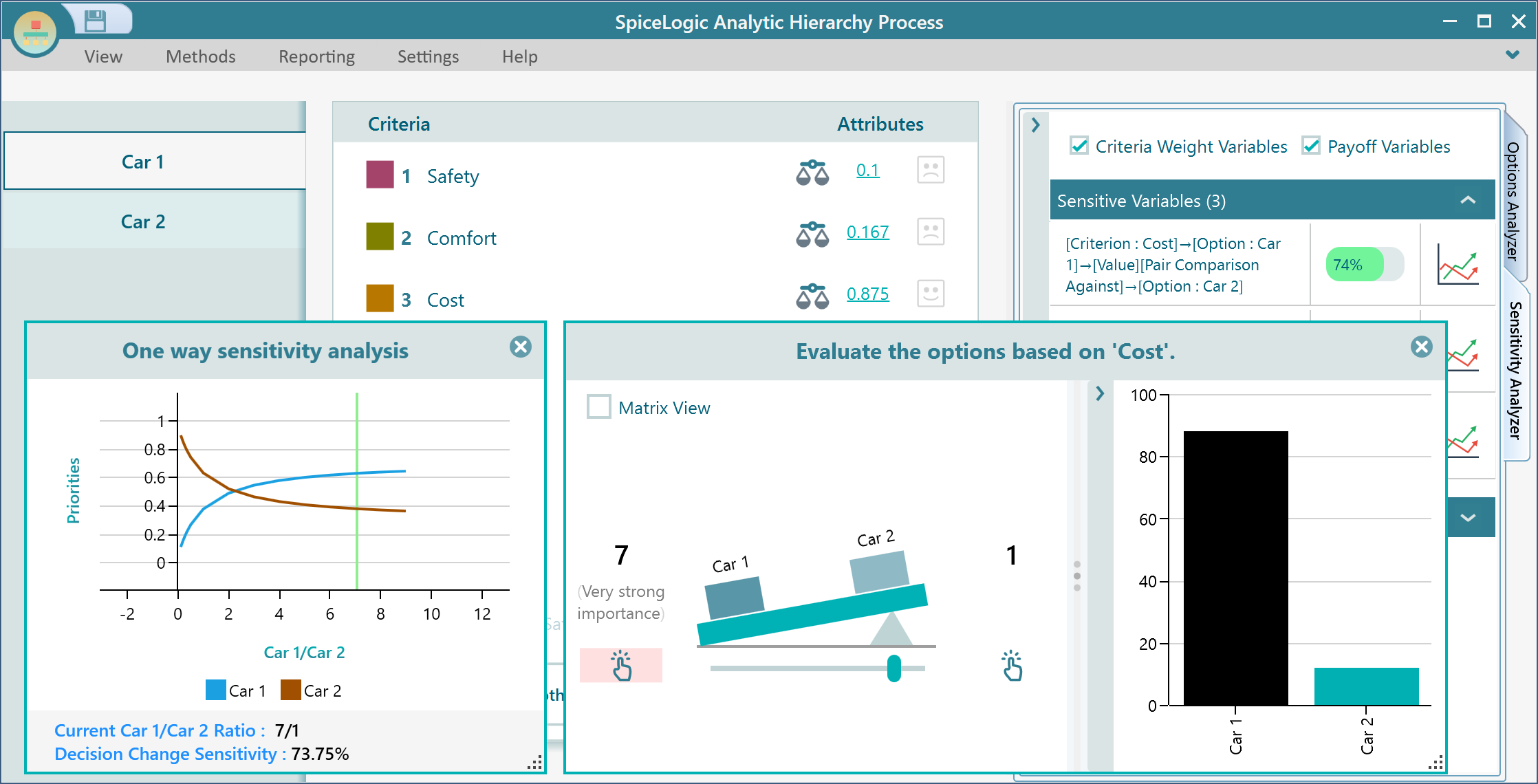
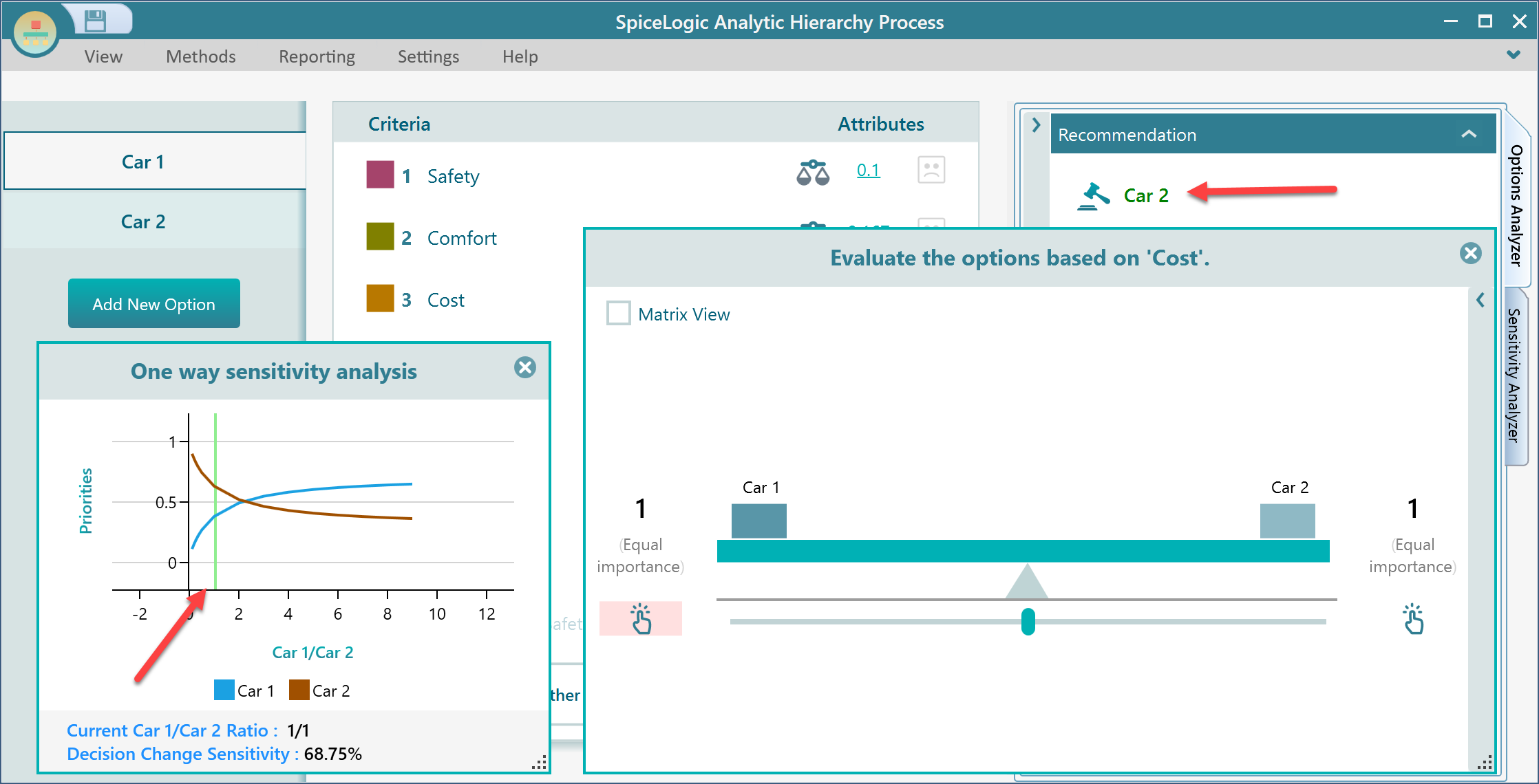
From the above screenshot, we can understand that the most sensitive variable is the comparison between Car 1 and Car 2 for the criterion "Cost". If you move the slider of this pairwise comparison, you will see the green vertical line moves according to the current value of the variable. You see from the above chart that, if the Car 1: Car 2 ratio changes such that if the Car 1/Car 2 values fall less than 2, then the winner choice will be changed from "Car 1" to "Car 2". Notice that, once the pairwise comparison value is changed from 7:1 to 1:1, the green vertical line moved to reflect the current value as 1, and notice the winner option changed from "Car 1" to "Car 2", whic is also reflected in the one-way sensitivity analysis chart.
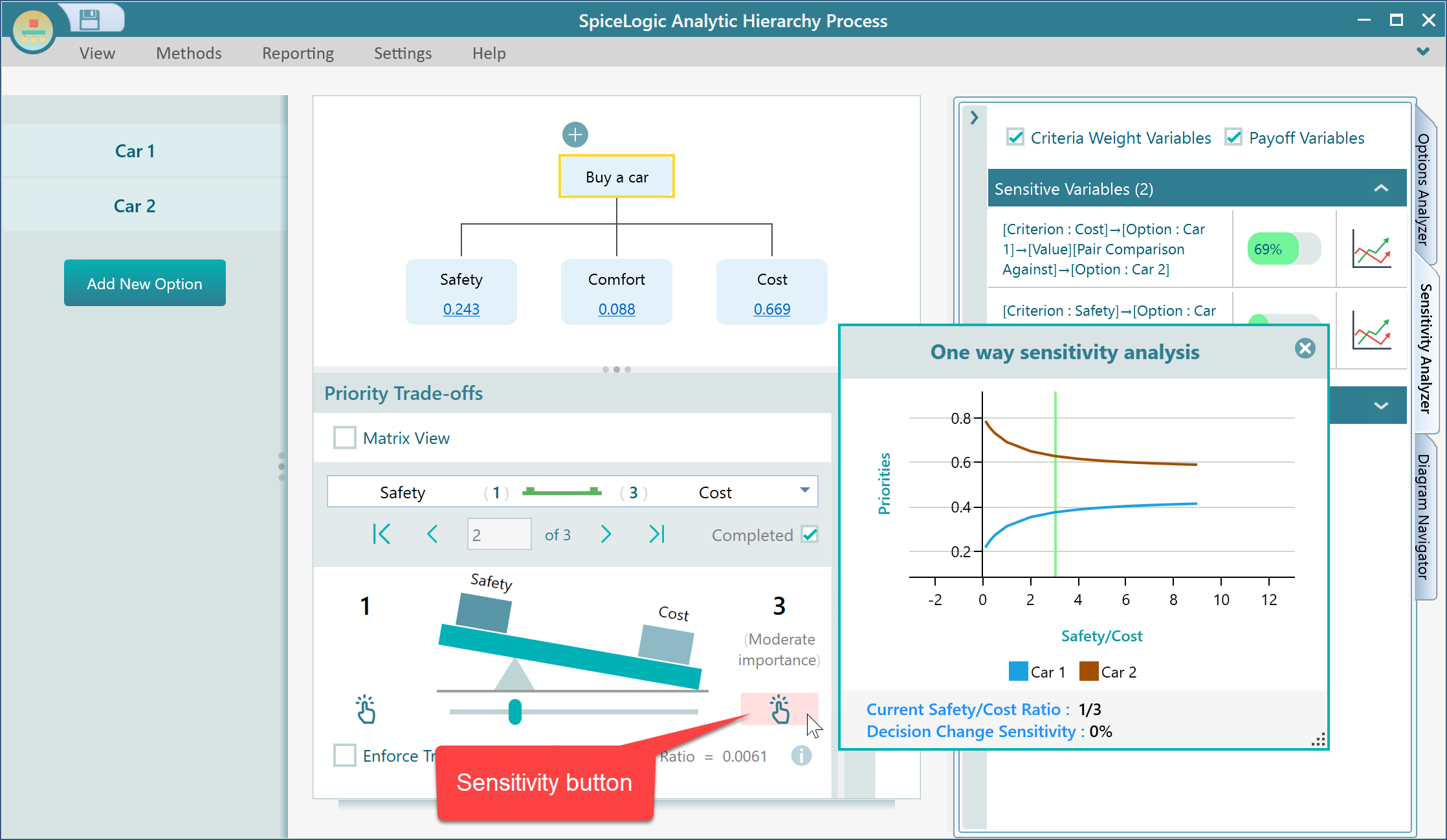
You can find the sensitivity of any variable by clicking on this icon that you see besides all variables.
View the Data Table or export the data table
Every chart in this application is featured with a context menu of powerful tools. For example, right-click on the one-way sensitivity chart, you will find options for "Export Image", "Copy image to clipboard", "Show data table", "Copy data table", "Export Data table to Excel" etc.
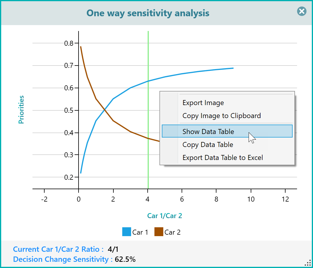
Let's click the "Show Data Table", you will see the table as shown below.
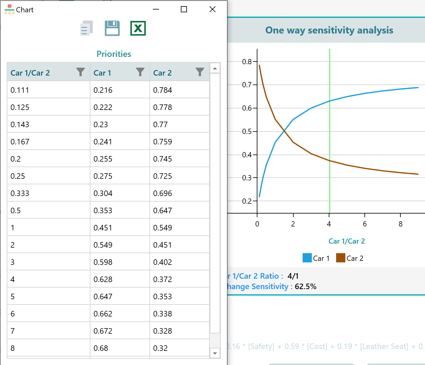
Notice that, even from this data table panel, you have the option to export the table to Excel.
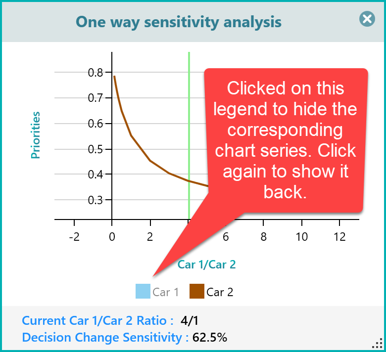
Select only the series that you want to view
Same as all other charts in this application, you can select a legend to show or hide an individual series of the chart. For example, in the above chart, you see two legends, one for Car 1 and one for Car 2. Just click on the legend for Car 1 (blue box), you will see the car 1 series is hidden. Click again to show it back.